
Website design
Pick a website design. Change any part.
Whichever look, intro or section design you pick, it’s made to fit, on every screen. Try it below.
Try it on Northline Barbers. Pick a colour, a palette and an effect, then move your pointer over the website.
Your main colour
Palettes made from it
Effect
Independent barbershop
Northline Barbers
Considered cuts, honest advice and an easy way to choose your barber and time.
Northline cut and finish
£42
Beard shape and tidy
£22
Runs on Shovva’s own colour recipe and effects, the same as a real Shovva website.
Design studio
Change every part by choosing, not designing.
Real screens from Shovva’s editor, with Northline Barbers as the example.
Tap any part. Pick its design.
Each section shows its designs as pictures, with your own words and photos in them.
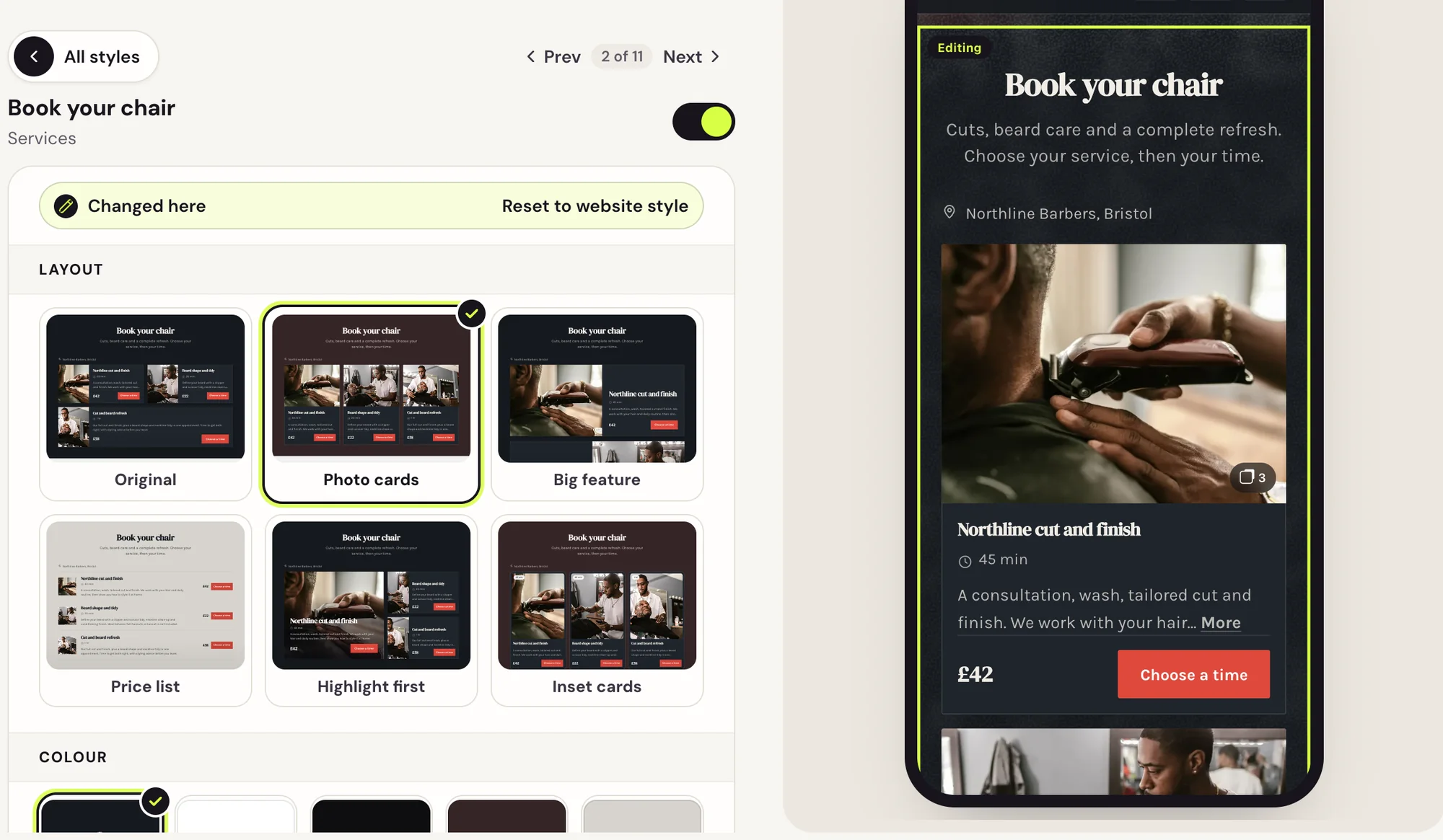
Top to bottom.
Every part of your website in order, each showing what it’s set to now.
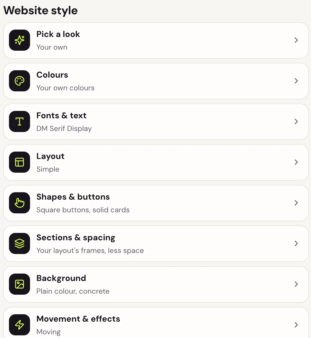
One colour, six palettes.
Three light and three dark, made from the colour you pick.
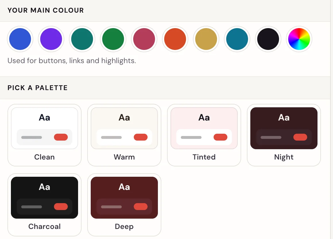
No mobile version to fix.
Every design works on phones, tablets and computers. Switch the preview between all three.
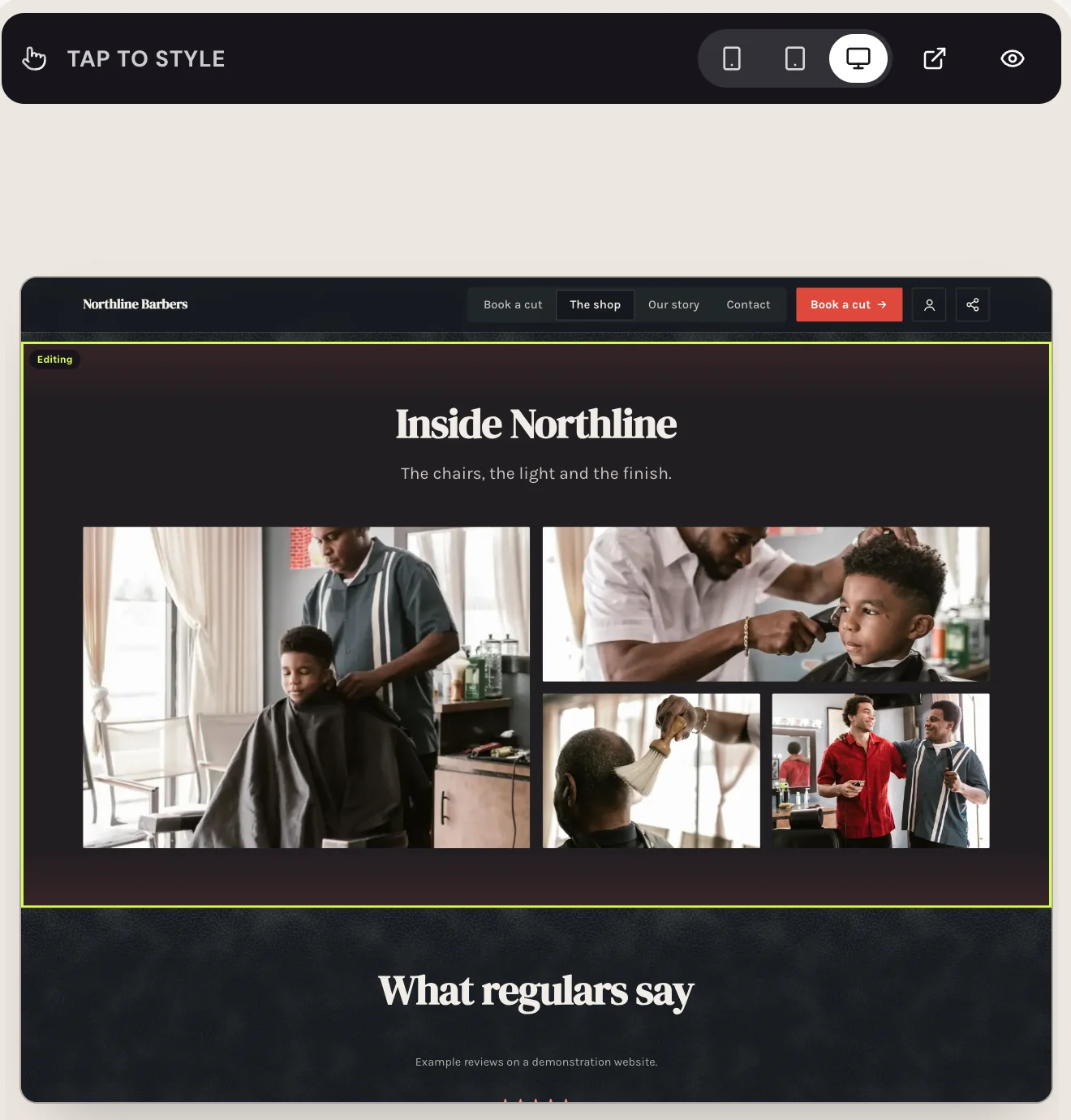
37 looks. Your words stay put.
Each look recolours the whole website and keeps every word and photo. Northline in four of them:
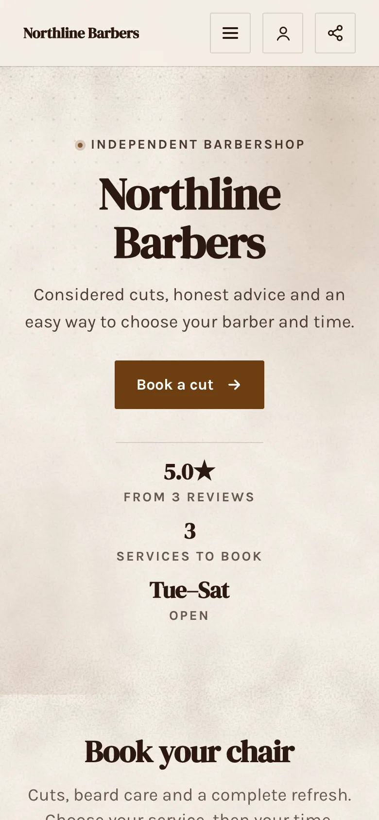
Editorial
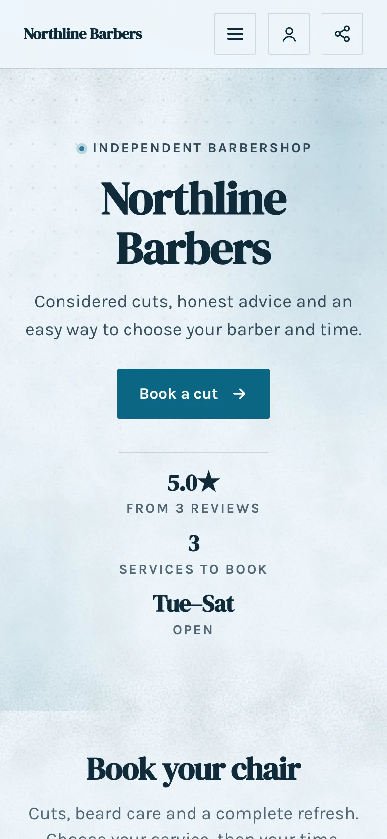
Coastal
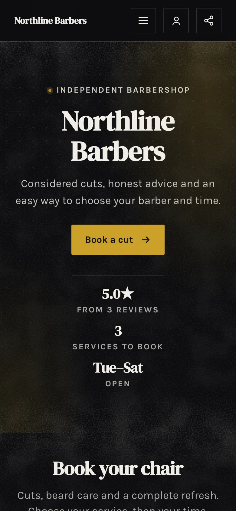
Obsidian
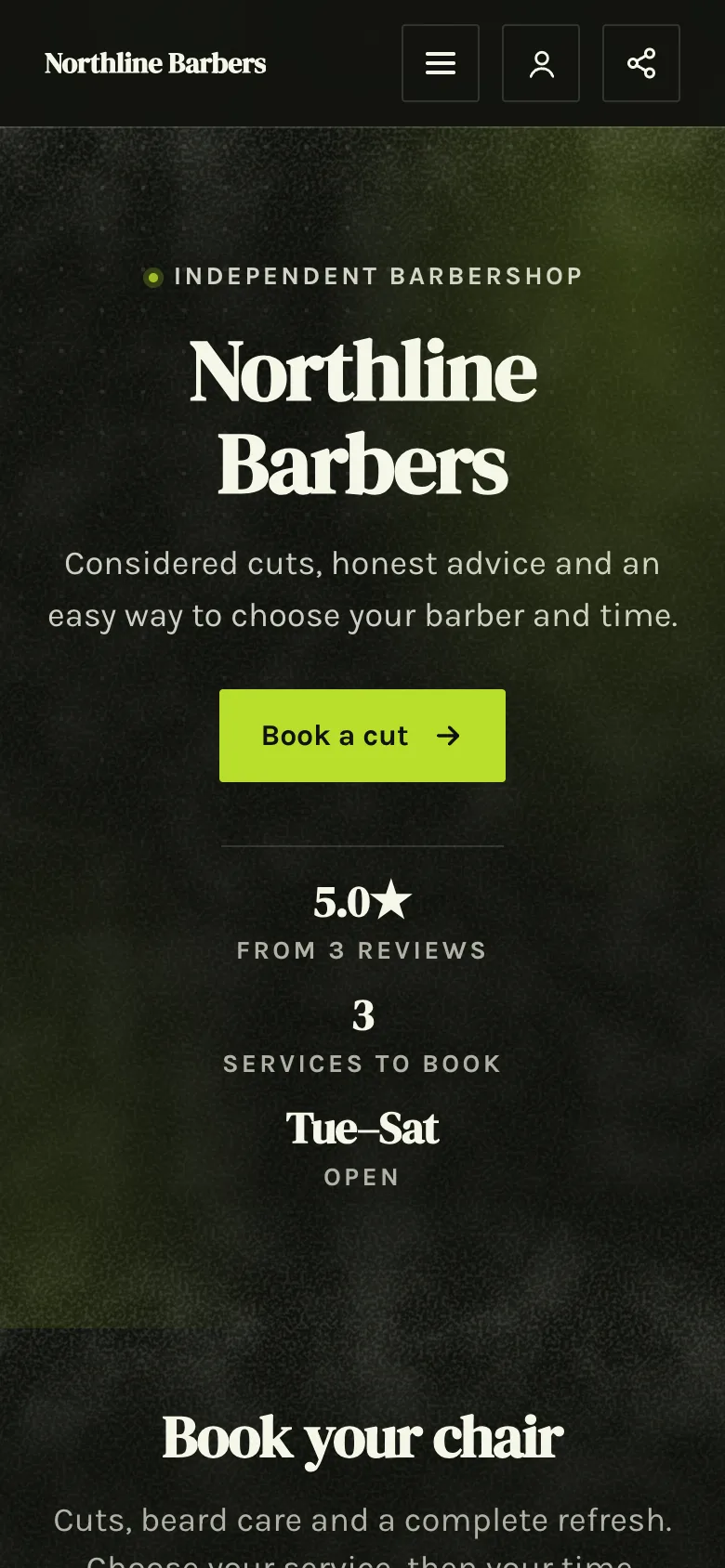
Wasabi
14 ways to open.
Words on the photo, a card over it, your name in big type and more.
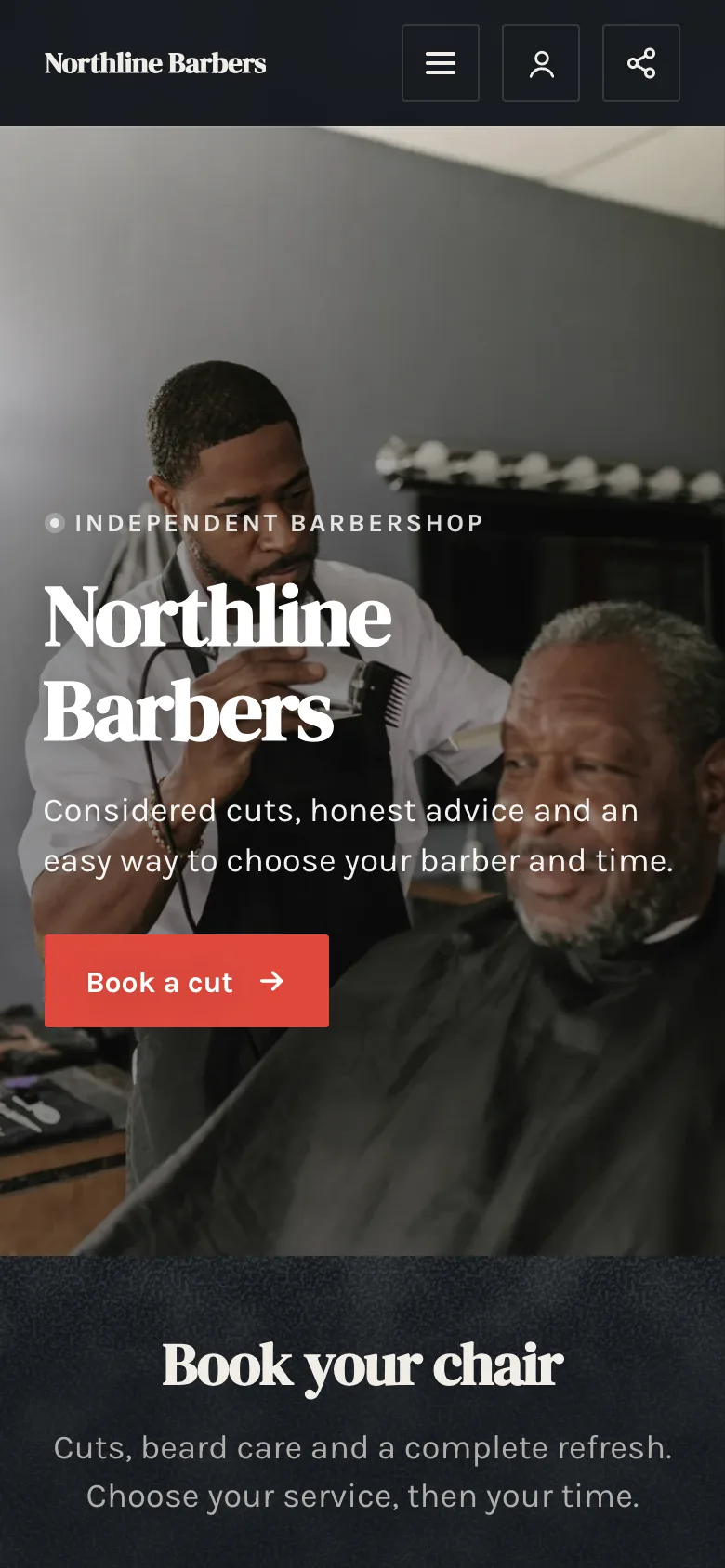
Words on the photo
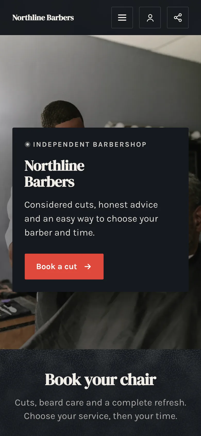
Card on the photo
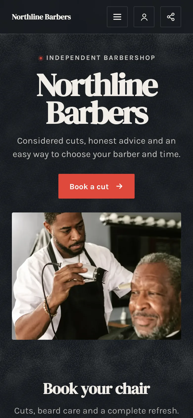
Big name
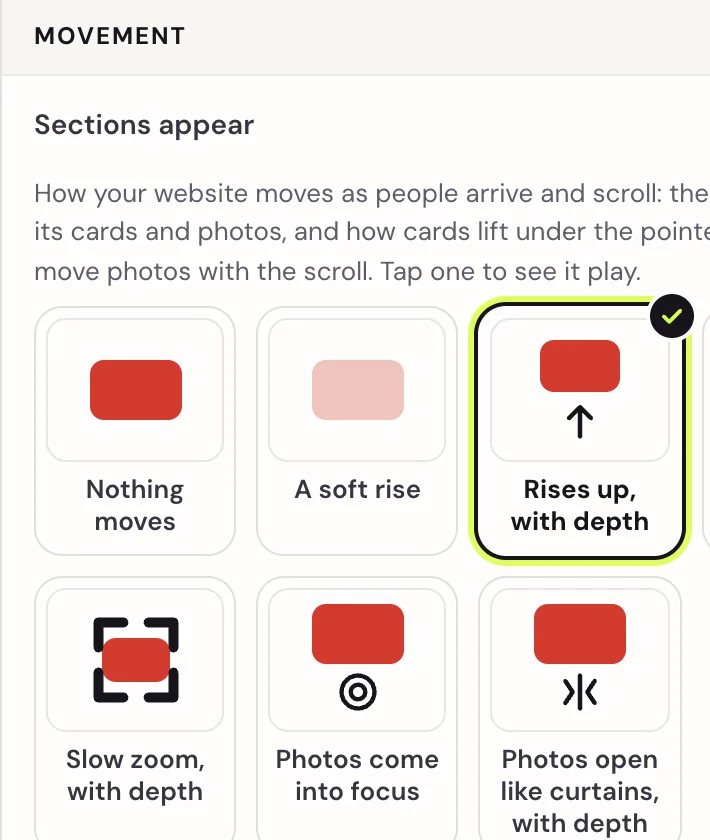
Seven ways to move.
Or none. Phones set to reduce motion see it still.
35 fonts, 8 pairs.
Pairs made to work together, or choose each font yourself.
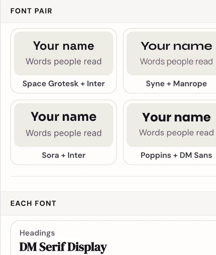
And the rest, by choosing.
A few clear choices for every part, each one shown on your website as you pick it.
Section designs
46 kinds of section. Each with its own designs.
Five of Northline’s sections, three designs each.
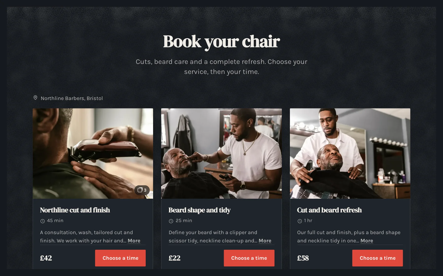
Photo cards
Photo on top, then the price and button.
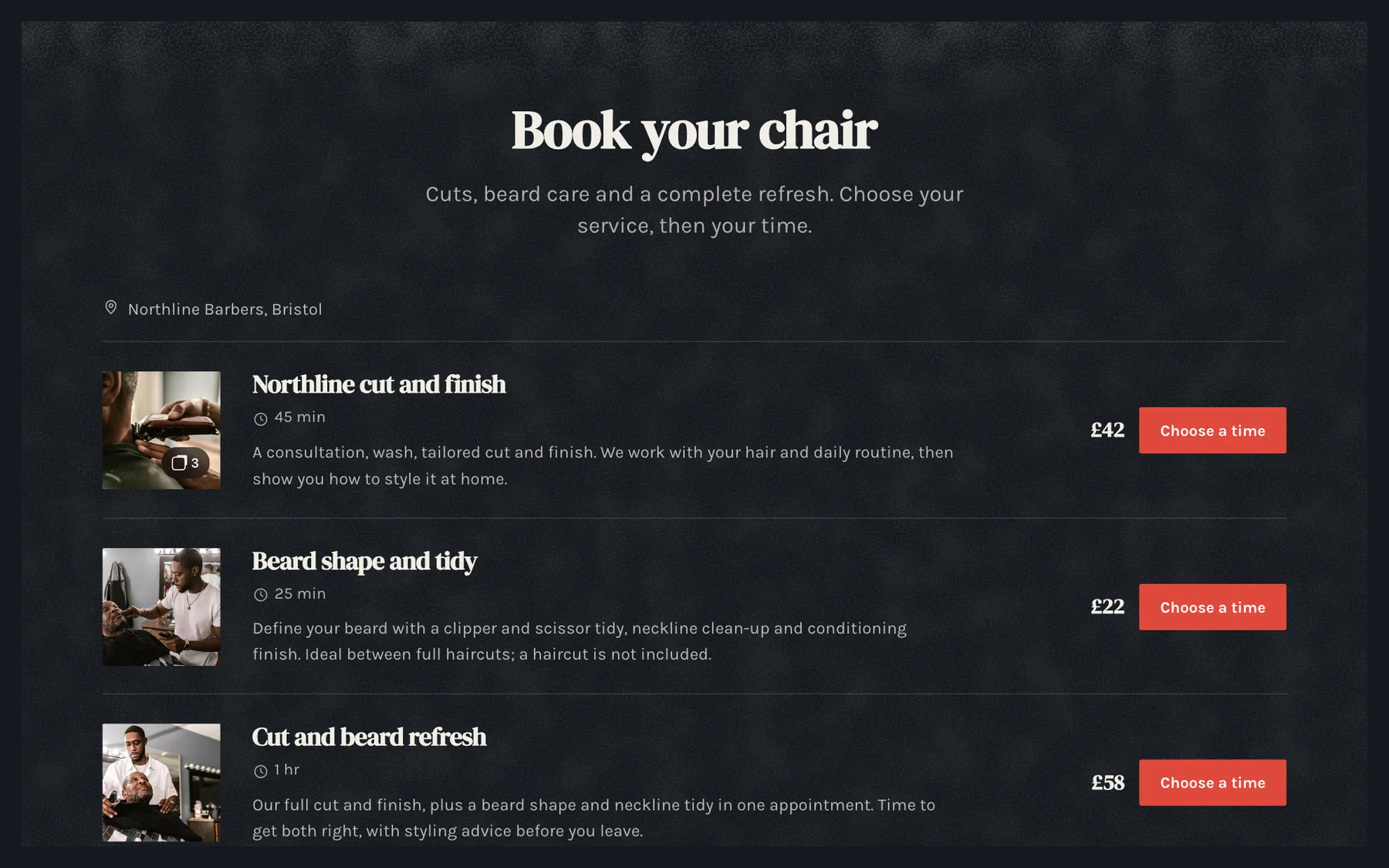
Price list
Tidy rows with the price and button on the right.
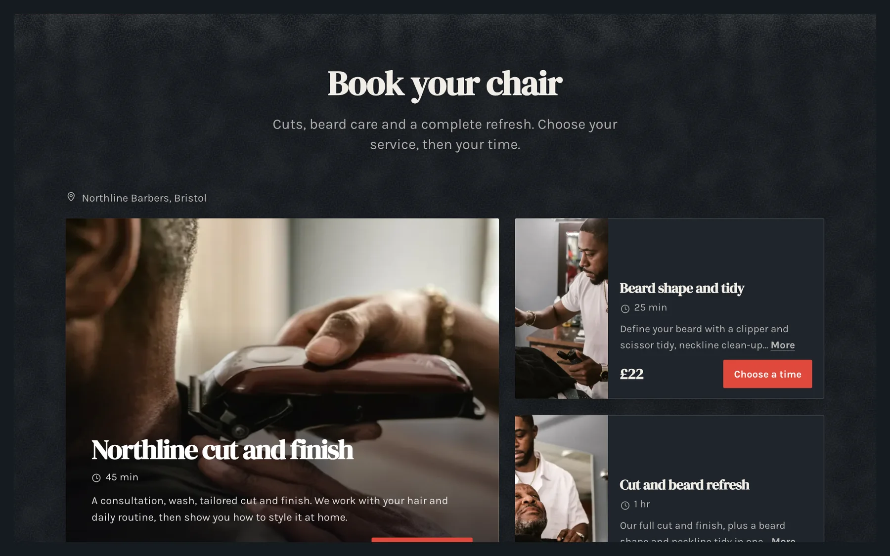
Highlight first
Your main service big, the rest beside it.
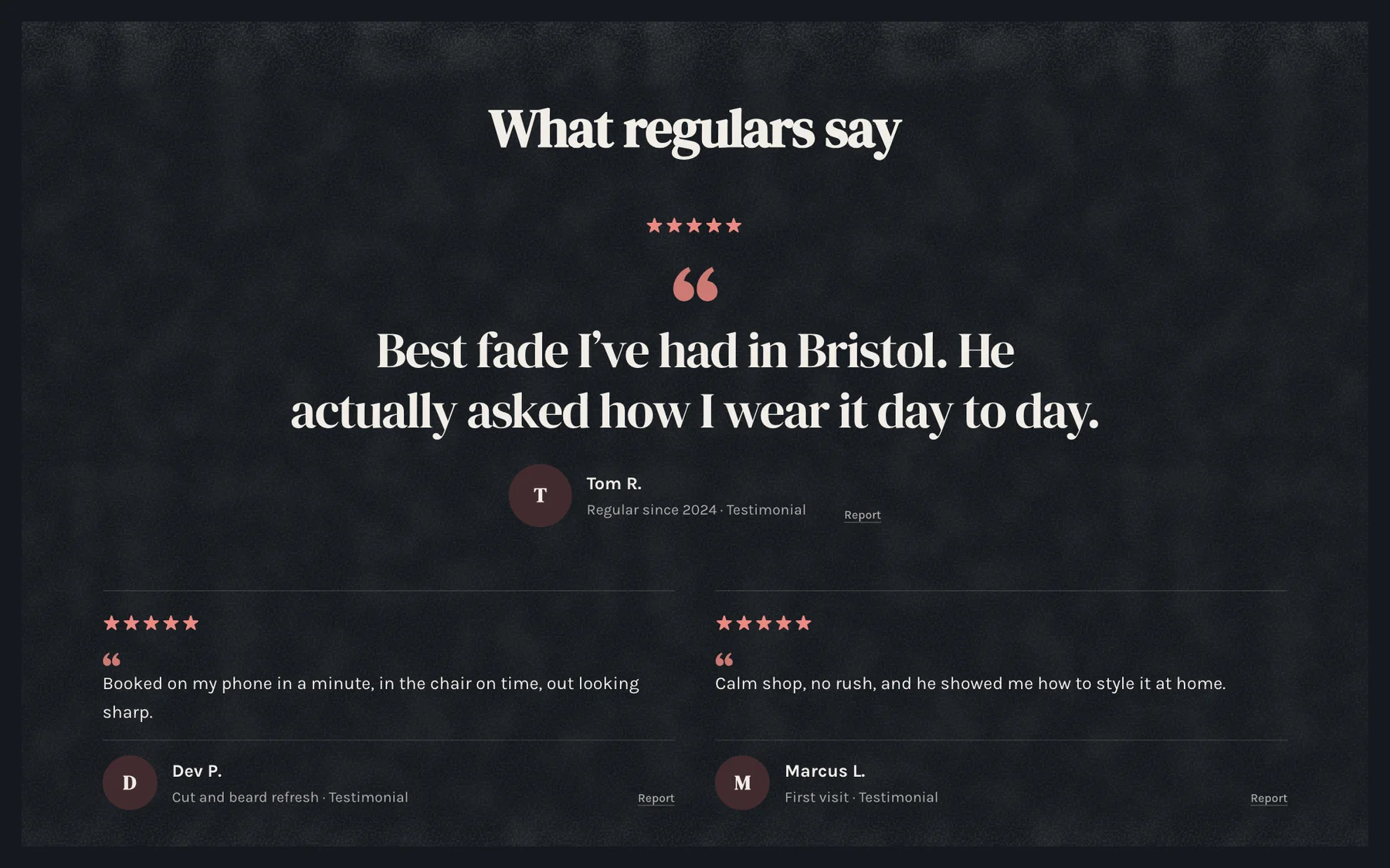
Big quote
One review, large.
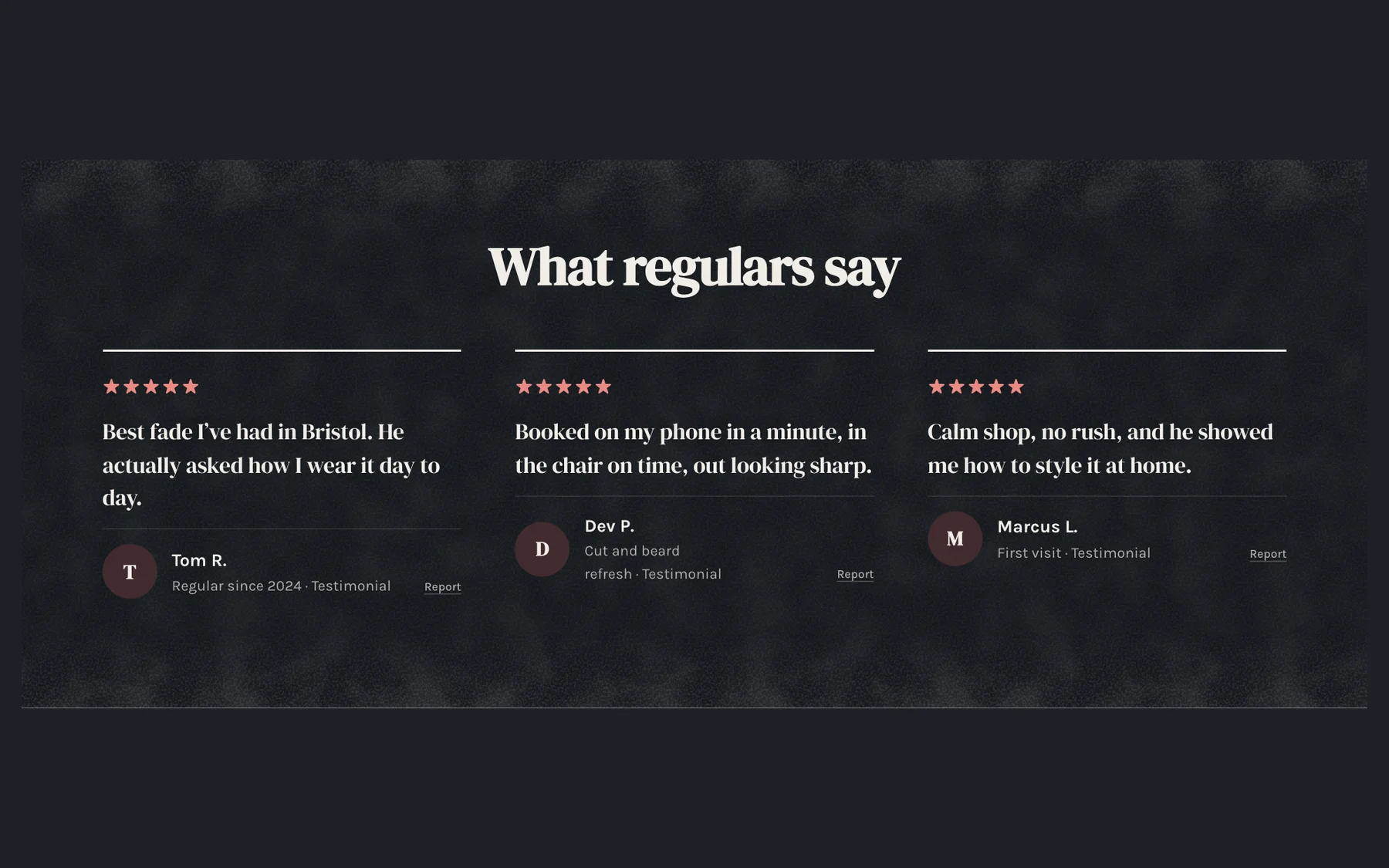
Quote wall
Every review at once.
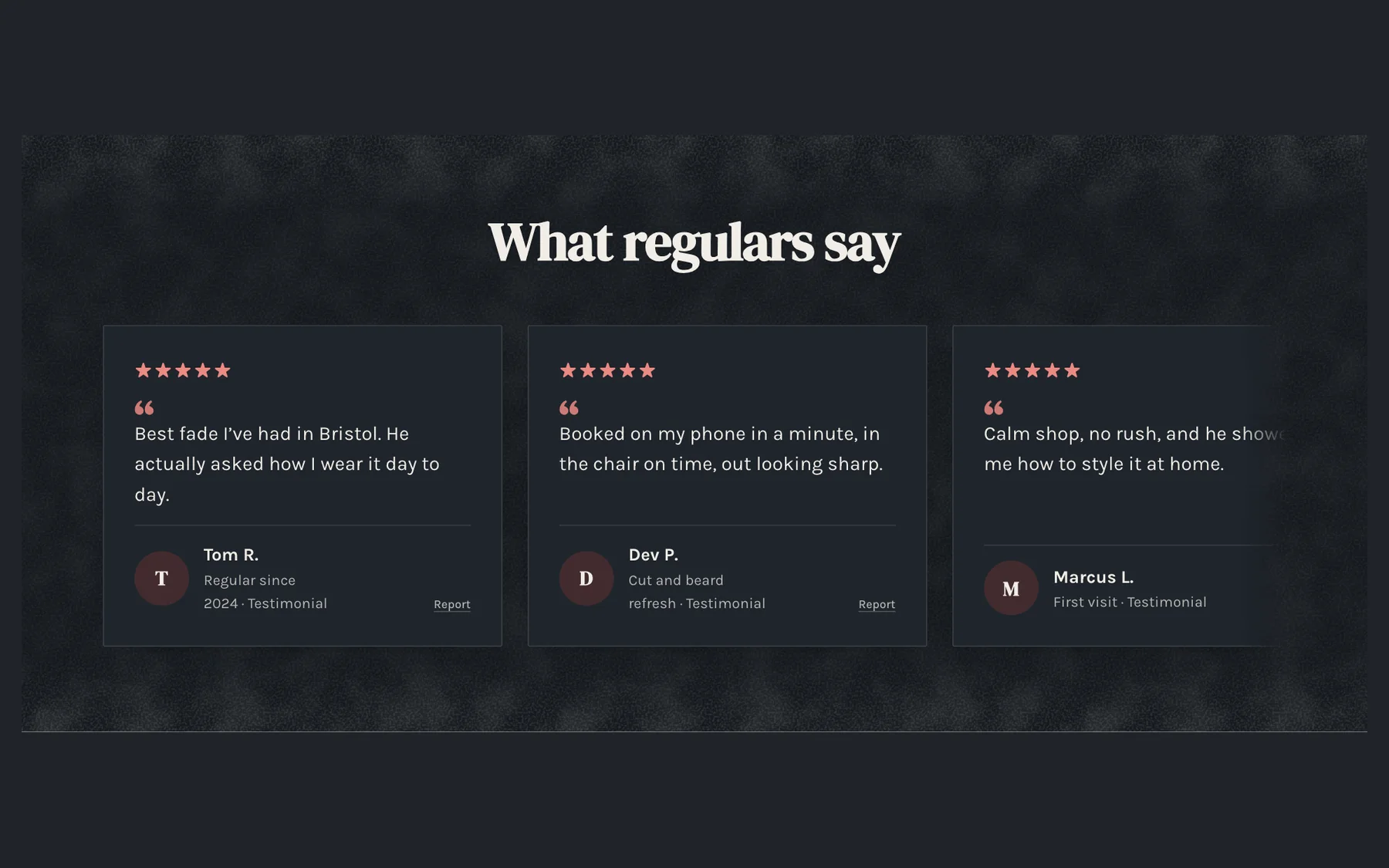
Swipe row
Reviews people swipe through.
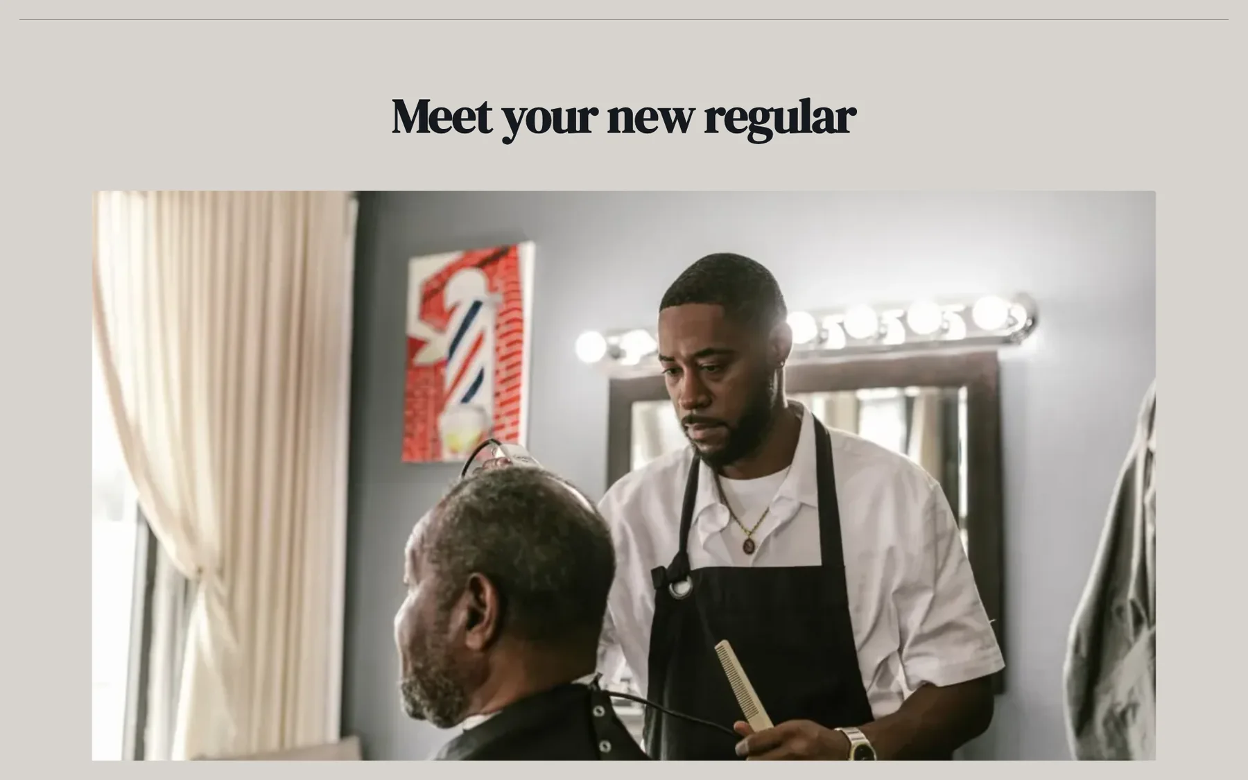
Big photo
Your story beside a large photo.
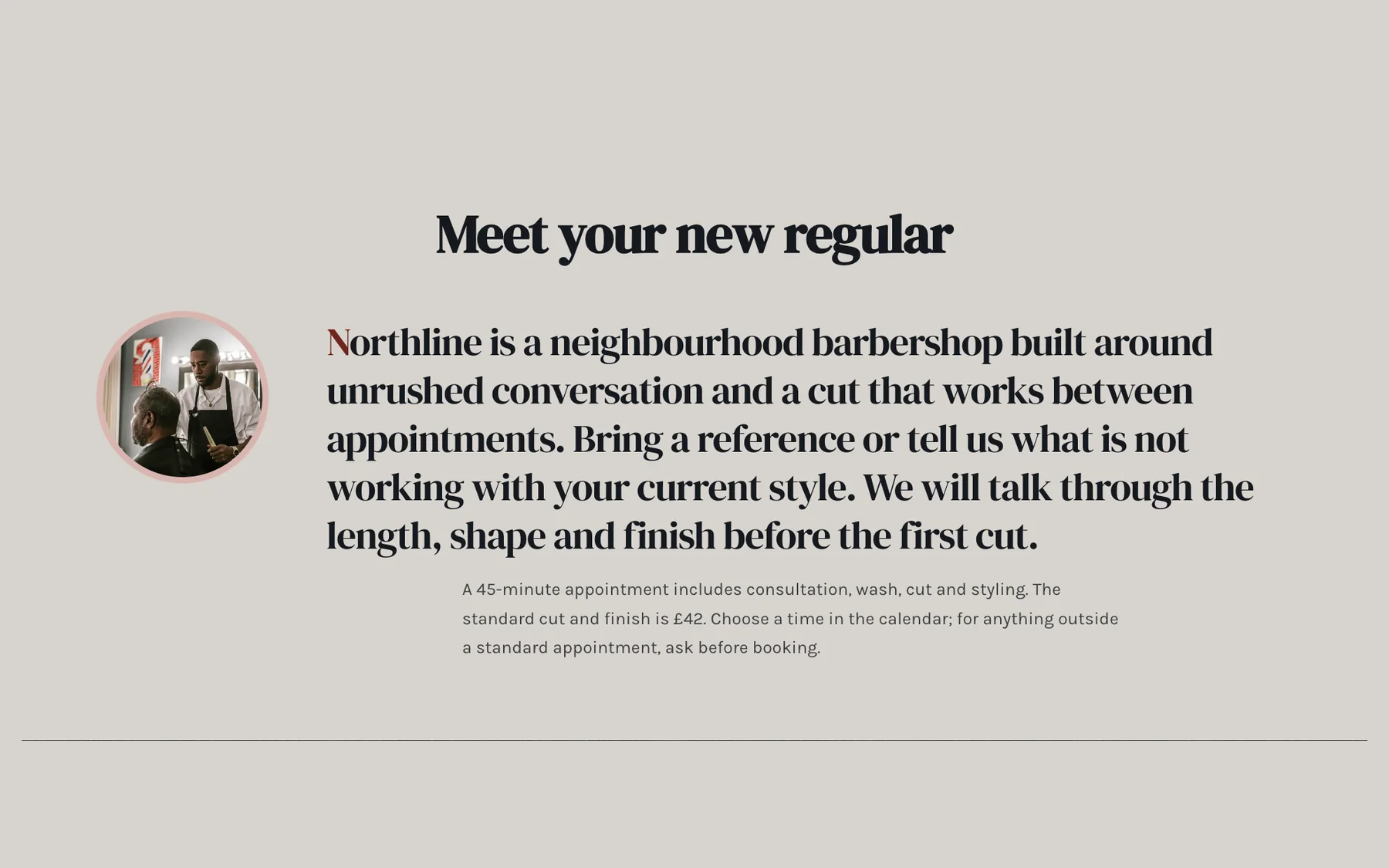
Big words
One line, set large.
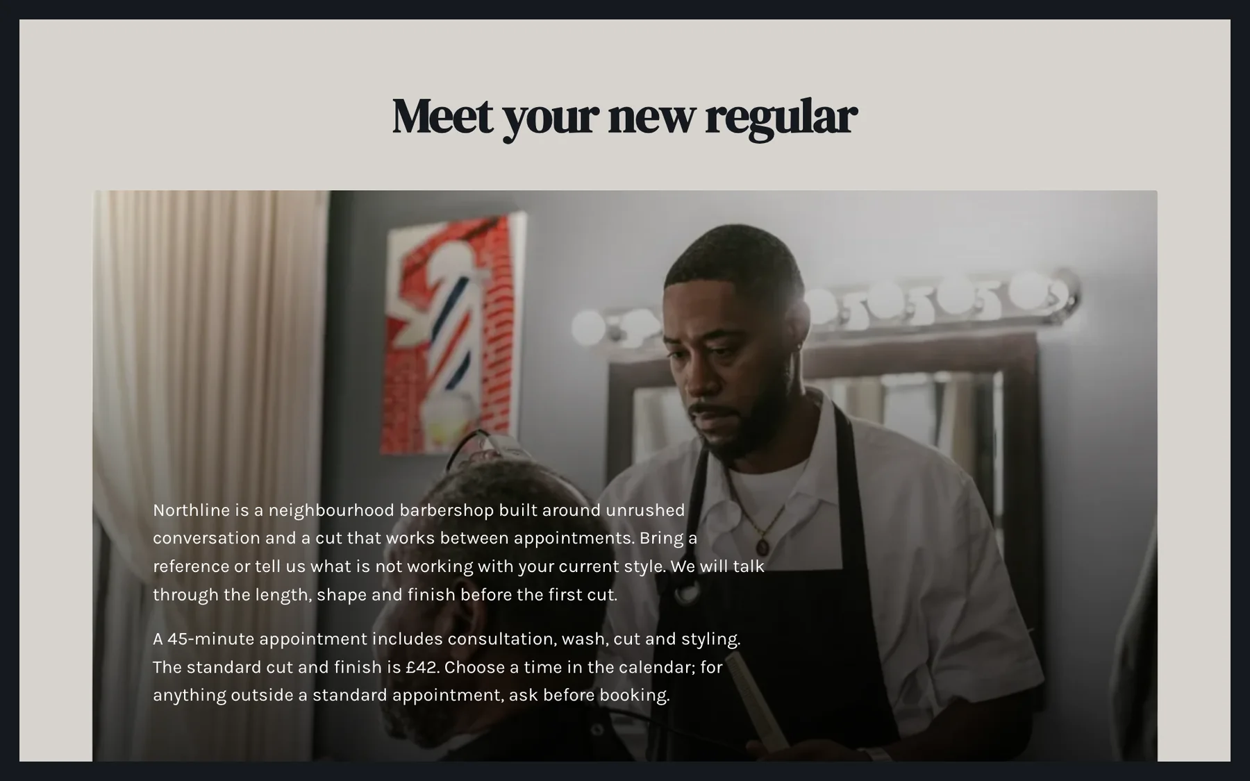
Words on photo
Your story over the picture.
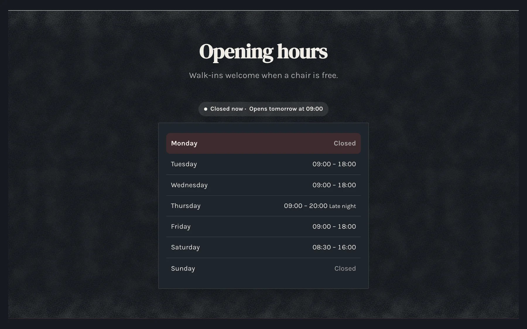
Hours card
Every day in one card.
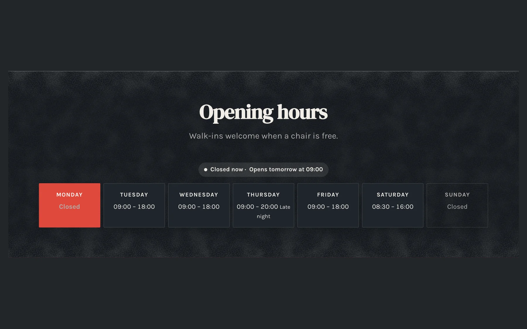
Week at a glance
The whole week across the page.
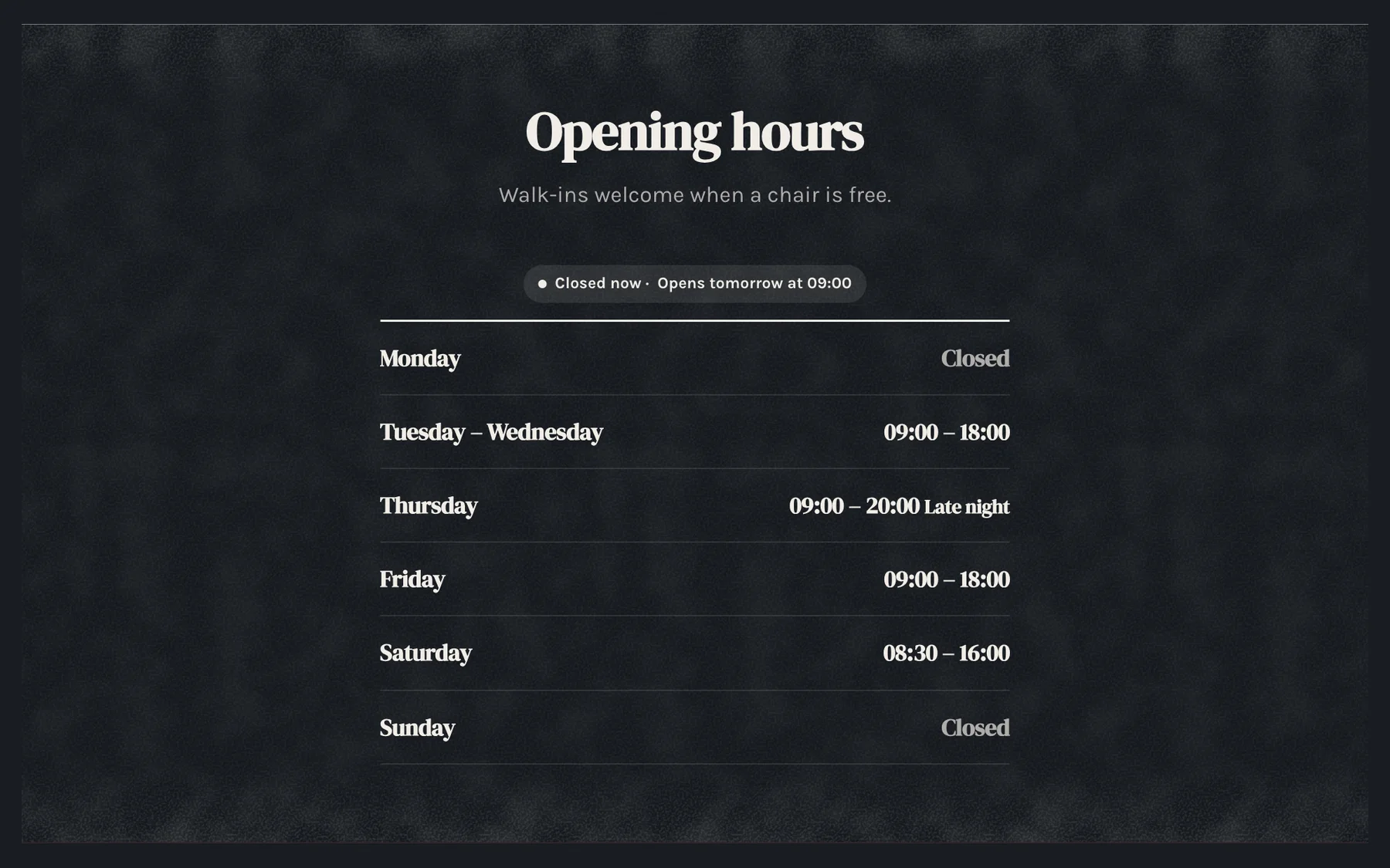
Short and sweet
Days with the same hours together.
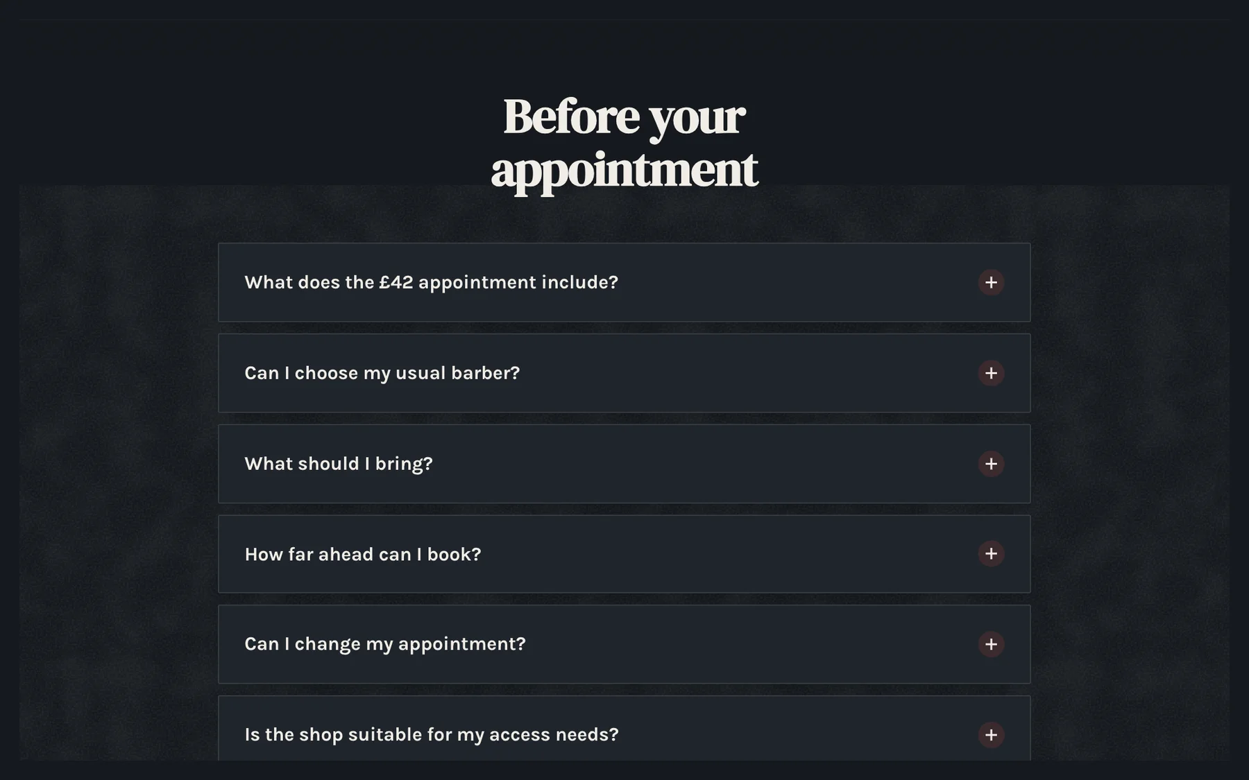
Question cards
Each question on its own card.
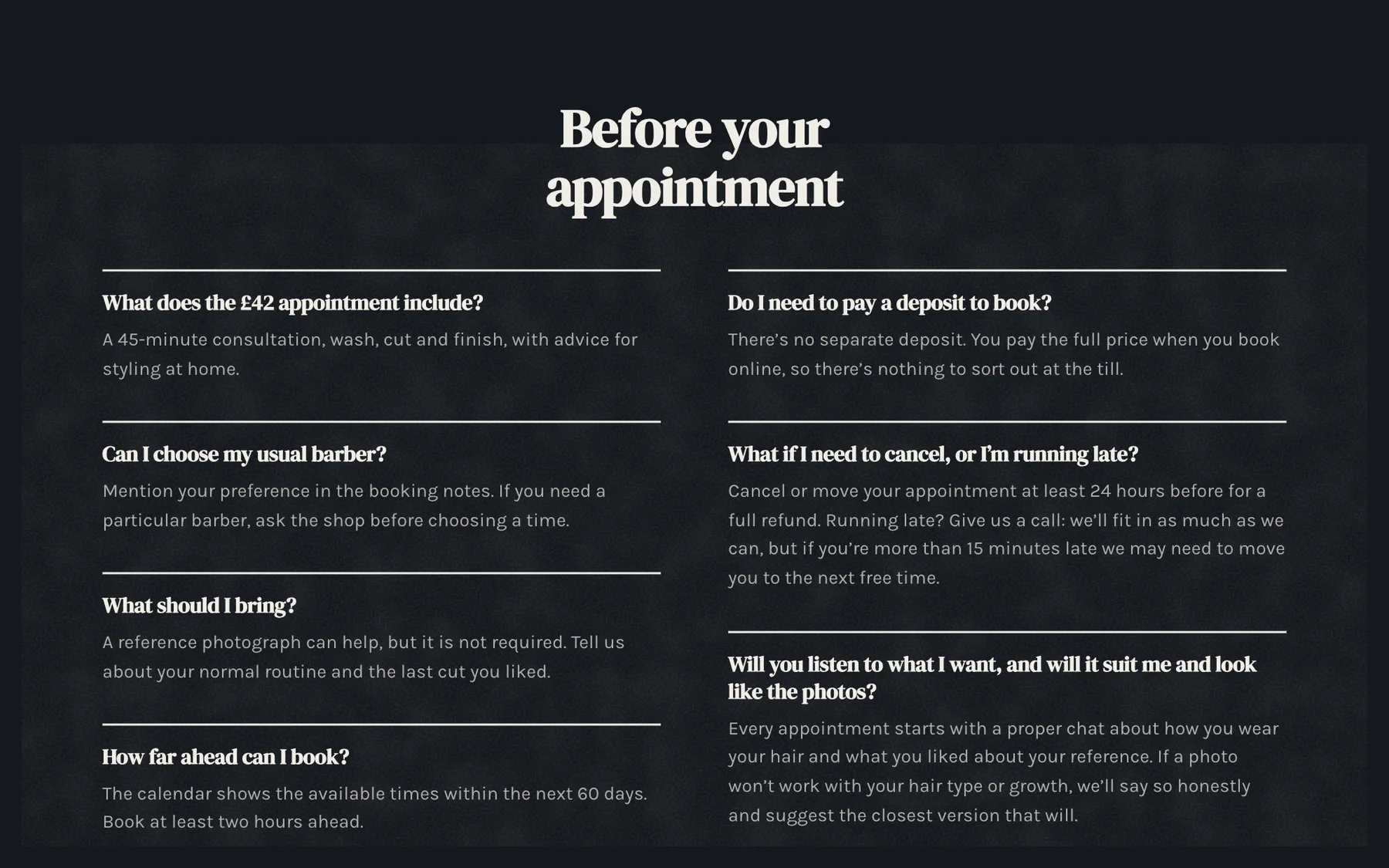
All answers
Every answer showing, in columns.
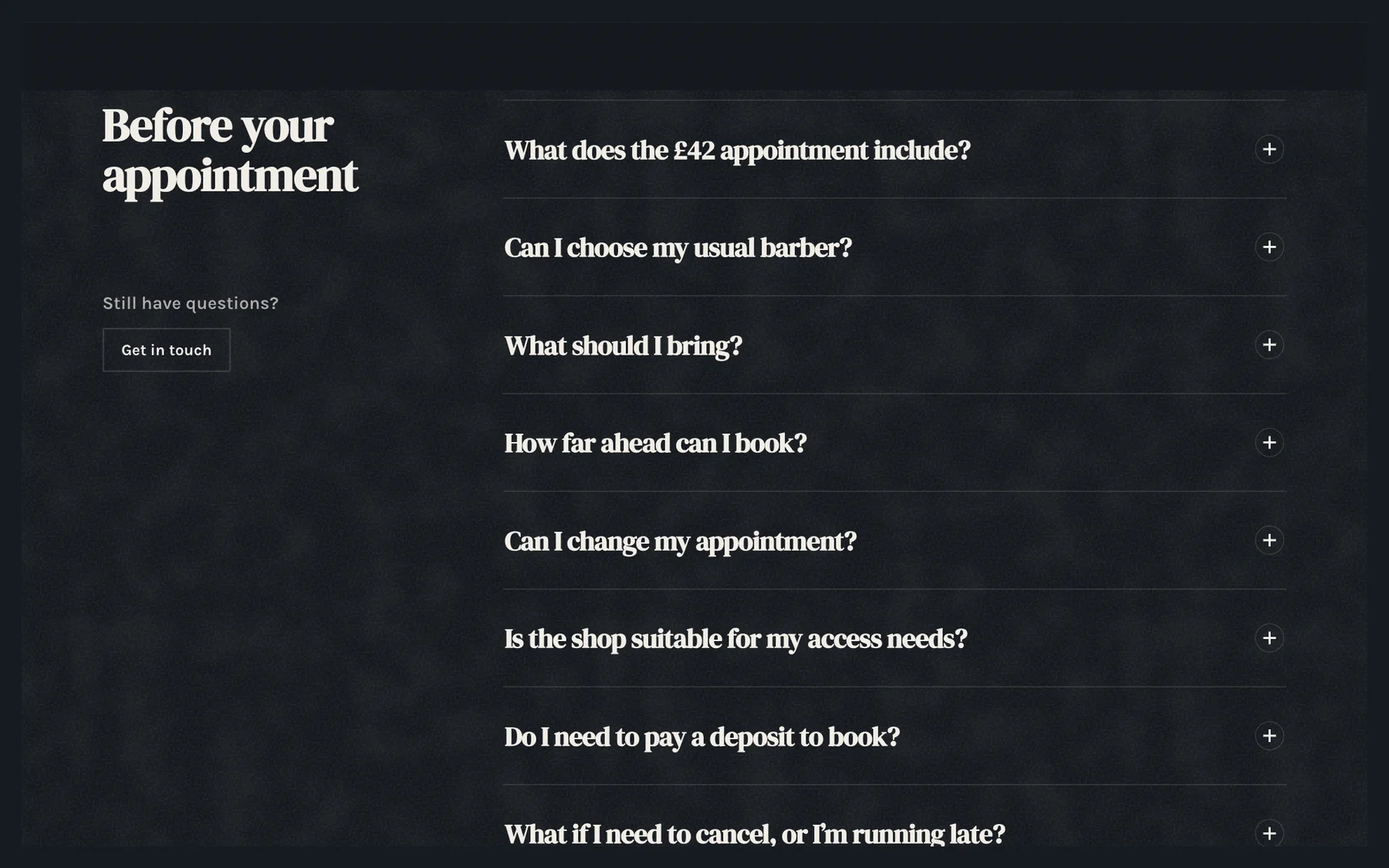
Split with contact
Questions beside a way to get in touch.
Start from a finished website.
Pick a template for your kind of business and Shovva builds yours in its look. Free to start, no card needed.
Questions
Design questions.
Still deciding? See how Shovva stacks up against the apps you use now.
How do I change a section’s design?
Open Style and tap the section, or tap it on the preview. Its designs show as pictures with your own words and photos, and the preview changes as you tap.
Can I change the look later?
Yes, any time, in Style. Changing the look or a section’s design keeps every word and photo, and Undo is always there.
Can I move things around?
You can reorder sections, turn them on or off and choose each one’s design. There’s no free-placement canvas, which is why nothing breaks on a phone.
Are effects and video on every plan?
Sections that move as people scroll, and effects such as petals, snow, sparkles and fireflies, are on every plan. Pro and Premium add every effect, including a pointer trail and a spotlight, and moving video behind your intro or website.